How to Read a Stress Score Across Several Hours
By Mr.Apps · Sep 17, 2026
Category:Stress

Read the shape before the peak
I read a stress score across several hours as a pattern of observations, not as a verdict about the day. The highest point can attract attention, but it may represent a short movement period, a measurement artifact, or a brief response that resolved quickly. Duration and repetition usually give more useful context.
Most consumer stress scores are estimates built from signals such as heart rate, heart-rate variability, movement, and sometimes skin conductance or temperature. The device does not directly observe a person's thoughts or assign a cause to the signal. The [review of smart devices for stress detection](https://pmc.ncbi.n


lm.nih.gov/articles/PMC8156923/) describes both the research potential and the validation limits of these approaches.
Begin with the graph's time scale. Identify where the score rose, how long it stayed high, whether it returned toward the usual range, and whether another peak appeared under similar conditions. A single high point and a long elevated band are different patterns even if the daily summary gives them similar colors.
Separate movement from quiet periods
Movement can change heart rate and related signals. A stress graph that rises during exercise, walking, climbing, or active work may be reflecting physiological demand rather than emotional distress. That interpretation is not guaranteed, but it is a reason to align the graph with the activity record.
Look for the start and end of a workout, commuting movement, household activity, or any period when the arm was moving repeatedly. Check whether the device was in a workout mode or whether a sensor-fit problem could have affected the recording. Do not compare a moving interval with a quiet baseline as if the conditions were identical.
The PPG stress detection review describes the difficulty of using optical signals for stress monitoring in real life, including the need for better validation and diverse study populations. Movement context is therefore a basic part of reading the score, not an optional detail.
Look for recovery windows
A useful graph has more than peaks. It has the periods between them. Note whether the score falls during quiet breathing, a break, a meal, a change of task, or sleep preparation. The length and consistency of these lower-stress windows can show whether the day contains opportunities for the body to settle.
Do not assume that a low score means complete recovery. A quiet period may reflect less movement or a different signal pattern while the person still feels tense, tired, or unwell. The graph can describe one layer of the day without describing the whole person.
I recommend marking three kinds of intervals: active demand, quiet but awake time, and sleep opportunity. This simple classification prevents a low reading during inactivity from being confused with a restorative period. It also shows whether the day has any repeated space for recovery rather than only one late pause.
Compare repeated peaks with the same context
Repeated peaks matter when they occur under comparable conditions. If the score rises at the same time each day, compare sleep, activity, meals, caffeine, medication changes discussed with a clinician, and the demands of the period. Keep the note descriptive. A repeated association is not proof of a cause.
The personalized stress detection review explains that biosignals and responses vary across people and situations. The same score pattern can therefore mean different things for different users. Personal comparison is useful for asking better questions, not for creating a diagnosis from a graph.
Avoid changing several factors at once. If you want to learn whether one routine change affects a recurring peak, change one practical variable, keep the observation window consistent, and record the result. If the graph becomes the focus of constant checking, reduce the checking schedule. Measurement should support a decision, not become an additional source of pressure.
Use the body's report as a second channel
The score does not know whether a person feels calm, tense, tired, ill, or focused unless the person supplies that information. Add a brief note when the difference matters. "Felt normal during peak" and "felt unwell during peak" are more useful than forcing a label such as good or bad.
The NIMH stress fact sheet distinguishes stress responses from the many circumstances that can produce them and gives practical context for recognizing when stress is affecting daily life. A wearable graph can support that reflection, but it cannot replace a mental health assessment.
Symptoms should set the safety priority. Severe breathing difficulty, chest discomfort, fainting, confusion, sudden weakness, or rapidly worsening symptoms require appropriate medical attention. Do not use a low stress score as reassurance against a concerning symptom, and do not use a high score as proof of illness.
Understand the daily summary
Daily summaries compress time. A single score may combine multiple readings, choose a threshold, or weight certain parts of the day. Ask whether the summary reflects an average, a maximum, the duration above a threshold, or a model's overall classification. If the explanation is not available, do not infer the method from the display.
The CDC guidance on managing stress treats stress as a physical and emotional response and includes sleep and physical activity in a broad approach. That supports using a trend to plan reasonable habits. It does not establish that one graph can measure emotional stress exactly.
Sleep is one of the most important longer recovery windows. The CDC explanation of sleep and heart health supports protecting regular, adequate sleep as part of health. If stress remains high across the day, a single calm hour should not be treated as proof that the underlying load has disappeared.
Build a low-noise review routine
Choose one or two review times rather than opening the app after every alert. At the first review, check the previous night's sleep and the morning baseline. At the second, review the shape of the day, the longest high period, the recovery windows, and the next practical choice. Keep the notes short enough to maintain.
Use the graph to decide what to do next: reduce optional intensity, take a quiet break, protect sleep, repeat a manageable breathing practice, or arrange professional support when a pattern persists or affects function. Do not use it to grade your day or to explain every sensation.
A four-part reading method
I ask four questions:
- How long did the elevated period last?
- What was happening during the rise and the recovery?
- Did a similar peak repeat under similar conditions?
- What did the person feel, and what low-risk action is justified?
This method favors time, context, and function over a single high point. A stress score can help organize attention across several hours, especially when the graph is compared with activity, sleep, and brief notes. It remains an estimate. Its best use is to support a calm next decision while leaving diagnosis and urgent care to the right source.
When the graph and the day do not match
Mismatch is common enough to plan for. A high score during a calm task may reflect movement, posture, temperature, sensor contact, or a model that has mistaken one physiological pattern for another. A low score during a difficult period may reflect missing data or a delayed update. Neither mismatch should be forced into a story.
I use the graph to choose a question, then use ordinary function to choose the response. If the person feels normal and the record is incomplete, improve the record and wait. If the person feels unwell, symptoms take priority even when the graph looks calm. If the graph is repeatedly high and the pattern affects sleep, concentration, or activity, save the time-stamped record and discuss it with an appropriate professional.
The stress fact sheet gives useful context for recognizing when stress is affecting daily life. It does not validate a consumer score. A previous ENSTA article on stress readings that do not match lived experience also supports keeping the two channels separate. The point of a multi-hour review is not to make the lines agree. It is to make the next decision safer and more specific.
If the graph is difficult to read, simplify it. Mark only the longest elevated period, the clearest lower window, and the next decision that changed. Ignore decorative scores and tiny fluctuations that do not alter behavior. Over several days, this reduced view is often more useful than a dense dashboard because it preserves the sequence of demand, pause, and return.
FAQ
Is the highest stress score of the day the most important reading?
Not necessarily. Duration, repetition, movement, the surrounding context, and symptoms may be more informative than one maximum. Check what was happening during the peak before interpreting it.
Does a low stress score prove that I am relaxed?
No. It may reflect lower movement or a particular physiological signal pattern. Compare it with how you feel, what you were doing, and whether the device captured a complete and reliable record.
How often should I review a stress graph?
Use a schedule that supports decisions without constant checking. One or two brief reviews can be enough to notice duration, repeated peaks, and recovery windows. Reduce checking if the graph increases worry without changing what you do.

*This article is for informational purposes only and is not a substitute for professional medical advice, diagnosis or treatment.*
Sources:
National Library of Medicine·National Library of Medicine·National Institute of Mental Health·Centers for Disease Control and Prevention·Centers for Disease Control and Prevention·National Library of Medicine
Related articles

Can Paced Breathing Work Without Watching a Screen?
Paced breathing does not require constant visual attention. This guide compares audio and haptic pacing, explains what a wearable may observe, and sets realistic expectations for relaxation and HRV without promising a guaranteed result.

Why a Health App May Tell You to Rest and Move at the Same Time
A health app can recommend rest and movement in the same day without either message being technically wrong. This guide shows how to check update time, purpose, symptoms, and the demands of the day before choosing a response.

Can a Wearable Measure Cortisol? What Your Stress Score Is Actually Estimating
Most consumer wearables estimate physiological stress from signals such as heart rate, HRV, temperature, and movement rather than measuring cortisol itself. I explain how to read those scores without mistaking an algorithmic clue for a hormone test.
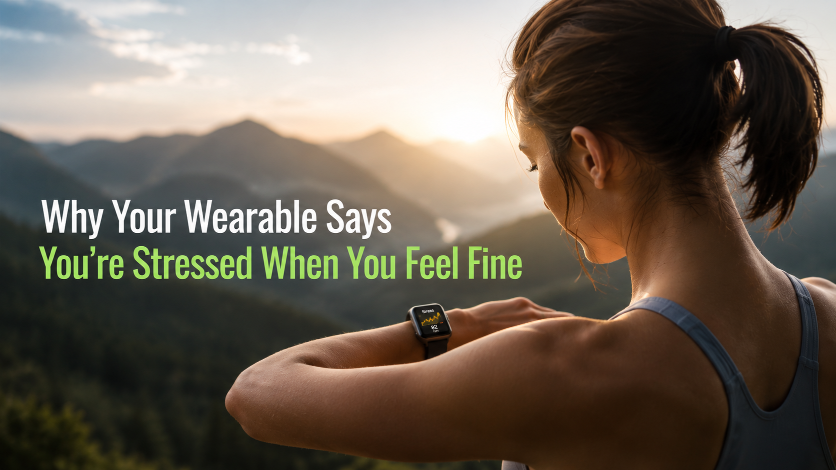
Why your wearable says you're stressed when you feel fine
Your watch measures physiological arousal, not worry. Caffeine, digestion, heat, short sleep, and a loose band can all push the score up while you feel fine.