How a Two-Week Stress View Differs From a One-Day Stress Score
By Mr.Apps · Sep 30, 2026
Category:Stress

One day and two weeks answer different questions
A one-day stress score may summarize signals collected during a defined part of the day. A two-week view may show a rolling pattern, a baseline comparison, or a composite of stress and recovery over several days. The longer view can put one daily result in context, but it may use different inputs and a different calculation. The titles alone do not tell a reader whether the two values are directly comparable.
A useful comparison begins with the exact question each card answers. The daily score may ask what physiological pattern the app estimated for one date. The two-week view may ask whether recent stress and recovery appear balanced over a longer window. A feature description of daily stress and longer resilience windows illustrates how a product can separate current or recent daytime patterns from a 14-day composite that also includes recovery signals.
That distinction matters when a score changes. One demanding day can move a daily result sharply while barely shifting a longer average. One calm day can improve the daily result even if the preceding week remains demanding. A longer view is less responsive to a single event, but that smoothing means it may also be slower to show a recent change.

A one-day score is a short summary, not a full explanation
A daily score can be convenient because it reduces several observations to one value. The inputs might include movement, heart-rate patterns, sleep timing, or other signals chosen by the product. But the result may not represent a continuous reading for every hour. It can also be affected by missing samples, the model's cutoffs, and how the app assigns a measurement to a particular day.
The word “stress” also needs definition. A wearable estimate may refer to physiological activation inferred from body signals. It does not directly measure the person's psychological experience or identify the source of the response. Work, exercise, a warm room, travel, an illness, or an emotional event can all coincide with changes in physiology. A score cannot decide which factor mattered without evidence beyond the sensor trace.
Public health guidance describes stress as both a normal response and a possible long-term concern. That everyday concept is broader than a one-day wearable estimate. A daily score can help someone notice a pattern, but it should not be read as a measure of every source or consequence of stress.
If the app presents a number for the whole day, check whether it uses a single summary, an average, a peak, or a portion of the waking period. These rules can produce different answers from the same underlying day. A score based on a few recorded intervals should not look like a complete account of the day unless the app explains the gaps.
What a two-week view can add
A longer view can show whether several daily readings move in a similar direction, return toward a typical range, or vary from day to day. It can reduce the visual weight of one unusual point and help a reader distinguish a short-term fluctuation from a repeated pattern. The result depends on the window: a rolling 14-day period updates every day, while a fixed two-week block changes only after the next block is complete.
Some longer-term features combine daytime stress with recovery information rather than simply averaging daily scores. A 14-day resilience description lists daytime stress, daytime recovery, and nighttime measures among its contributors. This is a product-specific example. It shows why a long view should identify both its duration and its inputs; it may be a composite, not a two-week total of one-day stress values.
A rolling lookback changes at both ends as time passes: a new day enters and an older day drops out. The resulting value can move even when today’s score is similar to yesterday’s, because the comparison period has changed. A fixed two-week summary behaves differently. The card should show its dates so a user can see whether a change reflects new data, an older day leaving the window, or a recalculation.
A longer window has trade-offs. It can make a persistent direction easier to see, but it may lag behind a new change. A rolling average can also conceal whether most days were moderate or whether a few high days shaped the result. A composite may remain stable because several inputs moved in opposite directions. The summary is useful only if the interface shows enough detail to interpret it.

Why one unusual day can look different in each view
Imagine that a person has a demanding day after several quieter days. The daily score may reflect a short-term response and appear elevated. In a two-week average, that one result is only one part of the period. If the longer view includes nighttime recovery, the value may also depend on what happened during sleep and on the app's formula for combining the contributors.
Now consider one unusually calm day in a period that has otherwise been difficult. The daily card may look reassuring, while the longer view changes little because most of its inputs come from earlier days. Neither display is necessarily wrong. They are answering questions at different time scales.
A timeline helps explain the difference. Show daily values as points or bars, then display the longer window separately with its start and end dates. If the app smooths or combines daily inputs, label that transformation. A two-week composite should not be drawn as though it were one measurement taken at the end of the period.
Research on the relationship between perceived stress and cardiovascular measures finds that these signals do not always align closely in daily life. A systematic review of self-reported stress and cardiovascular measures found that associations varied by measure, timing, and study method. Another review of stress and HRV notes that stress evaluation lacks one accepted standard. These findings support careful interpretation; they do not define any one app's score or diagnose stress from HRV.
Read the labels and inputs before comparing
Start with the dates. What is the start and end of the daily score's data window? Does “today” follow midnight, wake time, or another app-defined day boundary? Which exact 14 days are included in the longer view? A chart should distinguish the time measurements were collected from the time the result was reported.
Then inspect the inputs. Does the daily score use daytime heart-rate and movement data, or does it include sleep? Does the longer view include nighttime HRV, restorative intervals, or a personal baseline? If the two features use different signals, the relationship between their values is contextual rather than a direct arithmetic comparison.
A daily card should also state whether it summarizes the whole waking period, selected intervals, or a peak. Those summaries react differently to a brief demanding block. If the app presents only a category such as low, moderate, or high, the user still needs the collection span and the rule that produced the category. It should not imply continuous measurement.
Look for missing-data rules. A daily score may be absent or provisional when there are too few valid readings. A two-week feature may need a minimum number of complete days. If one day is missing, the app should say whether it was excluded, estimated, or carried forward. Otherwise, two periods that appear comparable may have different coverage.
The general-wellness guidance for consumer features is relevant because neither a one-day score nor a rolling view should be mistaken for a diagnosis or treatment recommendation. If the number concerns you, consider it alongside symptoms, context, and appropriate professional guidance. Do not change medication or treatment based on a score alone.
For a closer look at a short daily window, a guide to reading a stress score across several hours explains why its timing and shape matter.

Keep each window visible
A one-day score can help summarize a specific period. A two-week view can show a slower pattern, but it may smooth an unusual day, combine different inputs, and respond more slowly to recent change. The name “stress score” does not tell you which of those methods the app uses.
I would compare the two only after checking their time windows, inputs, and calculation rules. A daily result can help identify a question; a longer view can show whether the pattern repeats. Neither one alone explains the cause of stress or the full state of a person's health.
FAQ
Does a two-week stress view average the daily stress score?
Not necessarily. It may be a rolling average or a composite that also includes recovery measures. Check the feature's definition and inputs.
Can one stressful day change a two-week view?
It can contribute, but its effect may be smaller than in a daily score. The amount depends on the app's window and calculation.
Is a wearable stress score the same as how stressed I feel?
No. A wearable may estimate physiological patterns from body signals, while self-reported stress describes a person's experience. They are related but different records.
*This article is for informational purposes only and is not a substitute for professional medical advice, diagnosis or treatment.*
Sources:
Oura·Oura Member Care·Centers for Disease Control and Prevention·National Library of Medicine·National Library of Medicine·U.S. Food and Drug Administration
Related articles

Why a Restorative-Time Metric Needs Clear Start and End Rules
A restorative-time total depends on how a device defines the beginning, end, and eligibility of each interval. Learn which rules and coverage details make the estimate easier to interpret without treating missing data as proof that recovery did not occur.

Why Stress and Energy Scores Should Not Share the Same Alert Threshold
A stress estimate and an energy score can use overlapping signals while describing different things. Their alerts should reflect each score’s definition, time window and intended decision instead of applying one cutoff to both.

Why Mental Stress and Physiological Stress Need Separate Labels
A wearable can estimate changes in bodily signals without knowing what a person is thinking or feeling. Separating mental stress from physiological activation makes a health score easier to interpret and less likely to overstate what sensors can tell you.

Why Recovery From Stress Needs More Than One Calm Hour
One calm hour can be useful without erasing a full day of physiological demand. This guide explains how to read short recovery windows beside sleep, repeated peaks, symptoms, and longer trends.

What Resilience Means in a Health Tracker
A resilience score is usually an estimate of how stress exposure and recovery patterns change over time. This guide explains what the trend can show, what it cannot prove, and why resilience is not the same as mood or diagnosis.

How to Read a Stress Score Across Several Hours
A stress score is easier to understand as a time pattern than as one daily high point. This guide shows how to read duration, repeated peaks, movement, and recovery windows without treating a wearable estimate as a diagnosis.

Can Paced Breathing Work Without Watching a Screen?
Paced breathing does not require constant visual attention. This guide compares audio and haptic pacing, explains what a wearable may observe, and sets realistic expectations for relaxation and HRV without promising a guaranteed result.

Why a Health App May Tell You to Rest and Move at the Same Time
A health app can recommend rest and movement in the same day without either message being technically wrong. This guide shows how to check update time, purpose, symptoms, and the demands of the day before choosing a response.

Can a Wearable Measure Cortisol? What Your Stress Score Is Actually Estimating
Most consumer wearables estimate physiological stress from signals such as heart rate, HRV, temperature, and movement rather than measuring cortisol itself. I explain how to read those scores without mistaking an algorithmic clue for a hormone test.
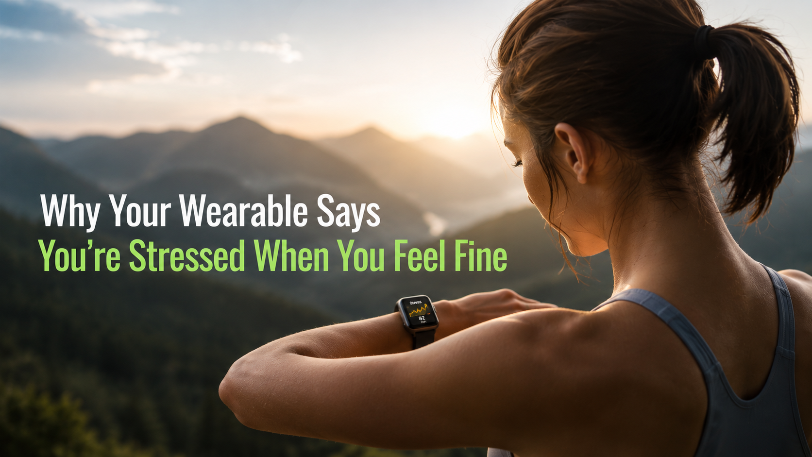
Why your wearable says you're stressed when you feel fine
Your watch measures physiological arousal, not worry. Caffeine, digestion, heat, short sleep, and a loose band can all push the score up while you feel fine.